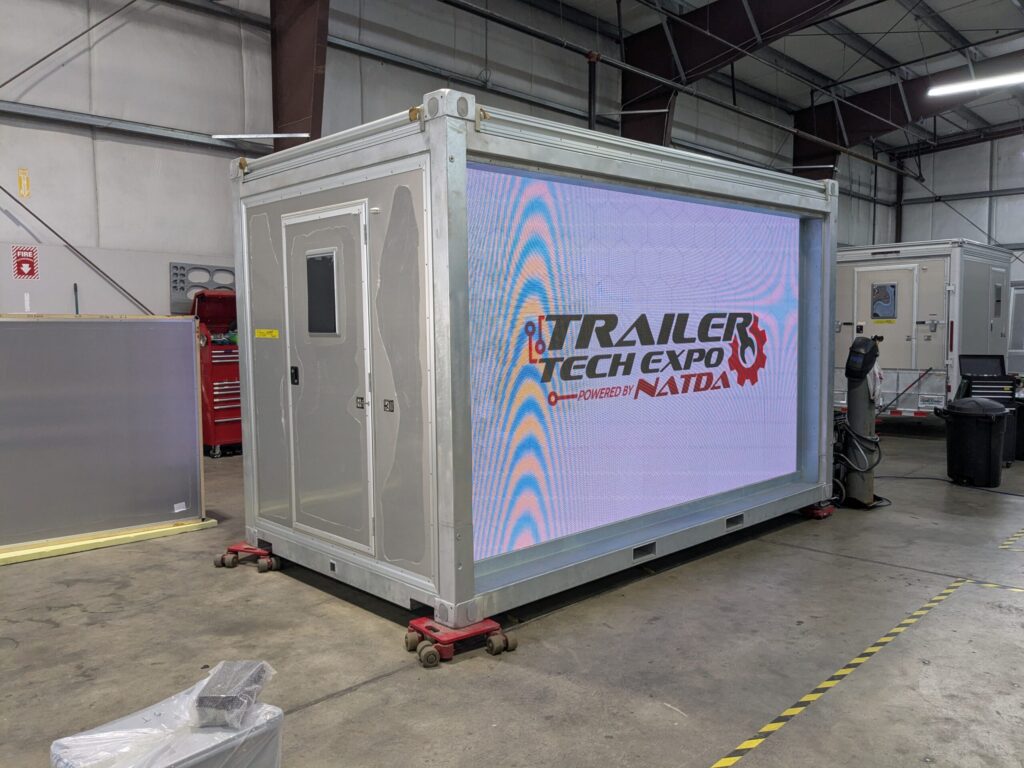
Video and graphic design knowhow joined forces with this project as I sought to create an engaging and informative video loop for a recent client’s trade show. This animation would play on a whopping 18-foot wide screen, which meant I had to make every pixel perfect! I had a lot of fun creating a seamless and stylish video for this client that stopped showgoers in their tracks.
Testing my animation before shipping out to the trade show!
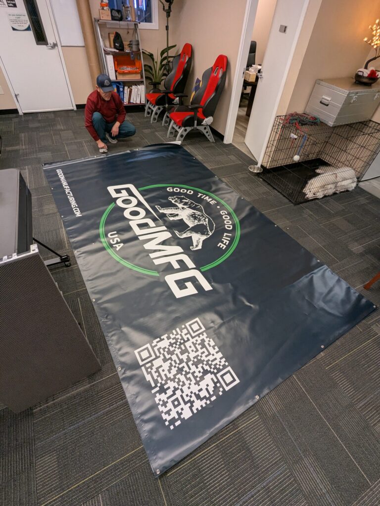
These huge banners served partly as protection for the sensitive LED screens they covered, but also functioned as a giant moving billboard for transport to a trade show three states away. Talk about eyeballs!
I designed and created a trade show display, utilizing the existing aluminum composite panel product my client was hoping to showcase.
I created a vinyl wrap that conformed to the shape of the aluminum panel, without obscuring too much of the sleek aluminum finish. It was a bit of a balancing act trying to find the right middle ground between showing enough of the aluminum panel to properly advertise the product, and showing so much that it made vinyl installation of so many tiny letters and shapes difficult.
I think I found a good balance between the two, as you can see in the image above. I intentionally created free-floating elements that required less pesky transfer paper while still showed off the clean look of the panel’s aluminum finish.
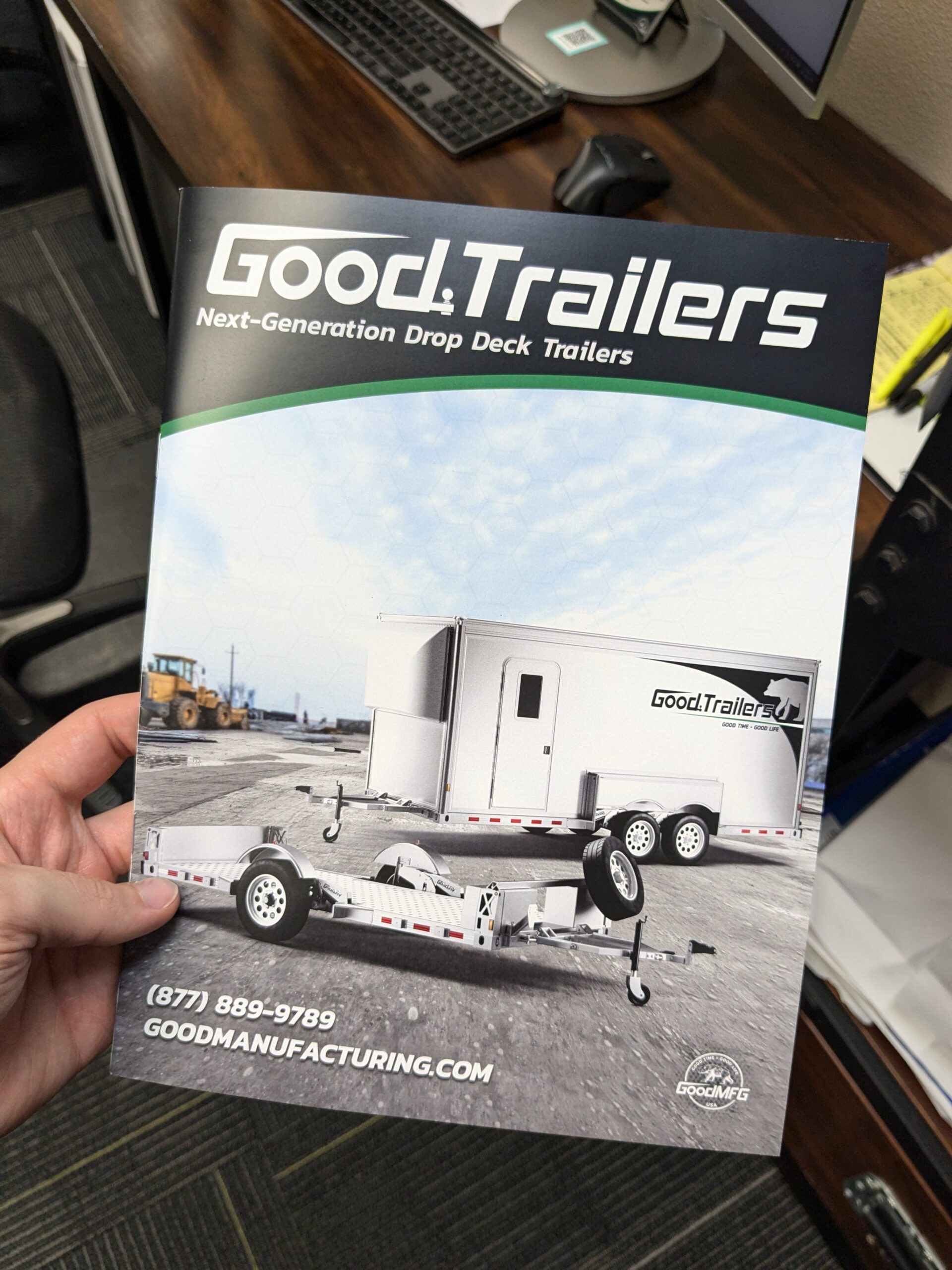
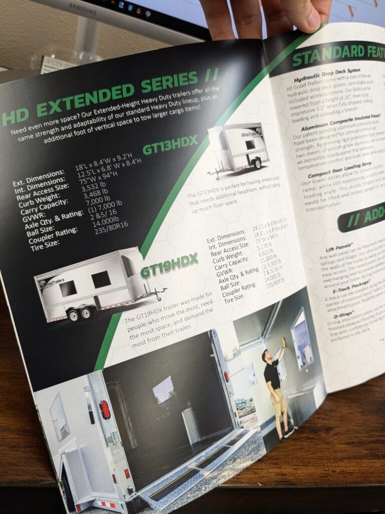
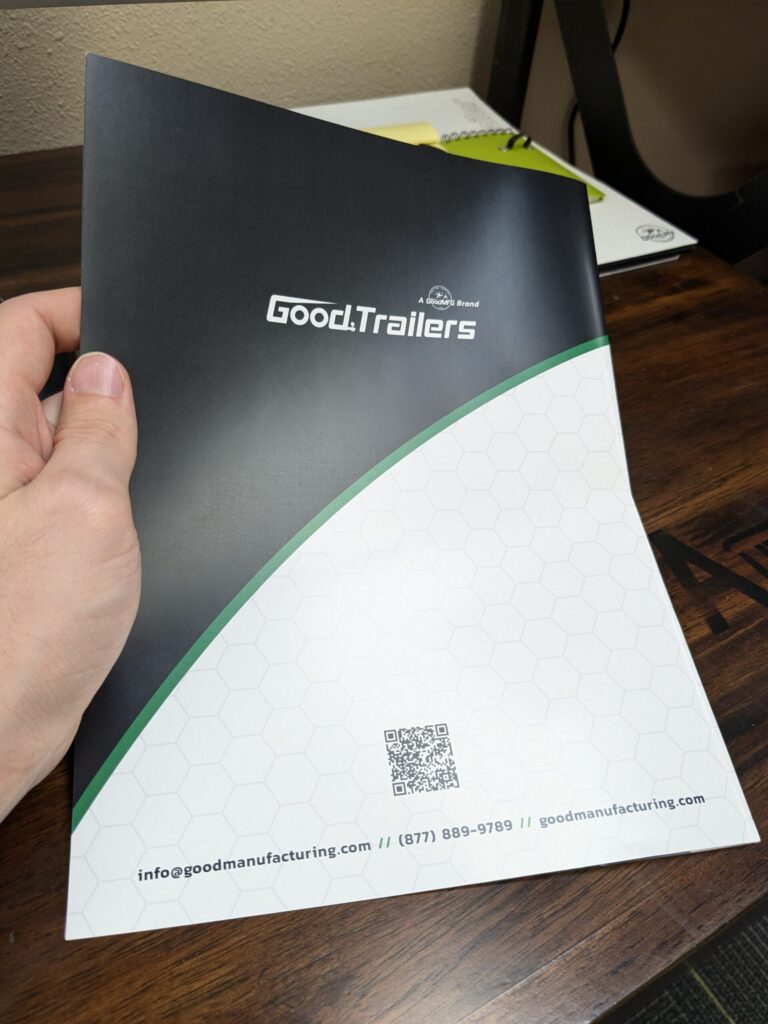
I designed an informative and modernized product booklet for a client in the trailer manufacturing industry. I even arranged for local printing and compared pricing and quality to create a piece they were proud of and could afford!
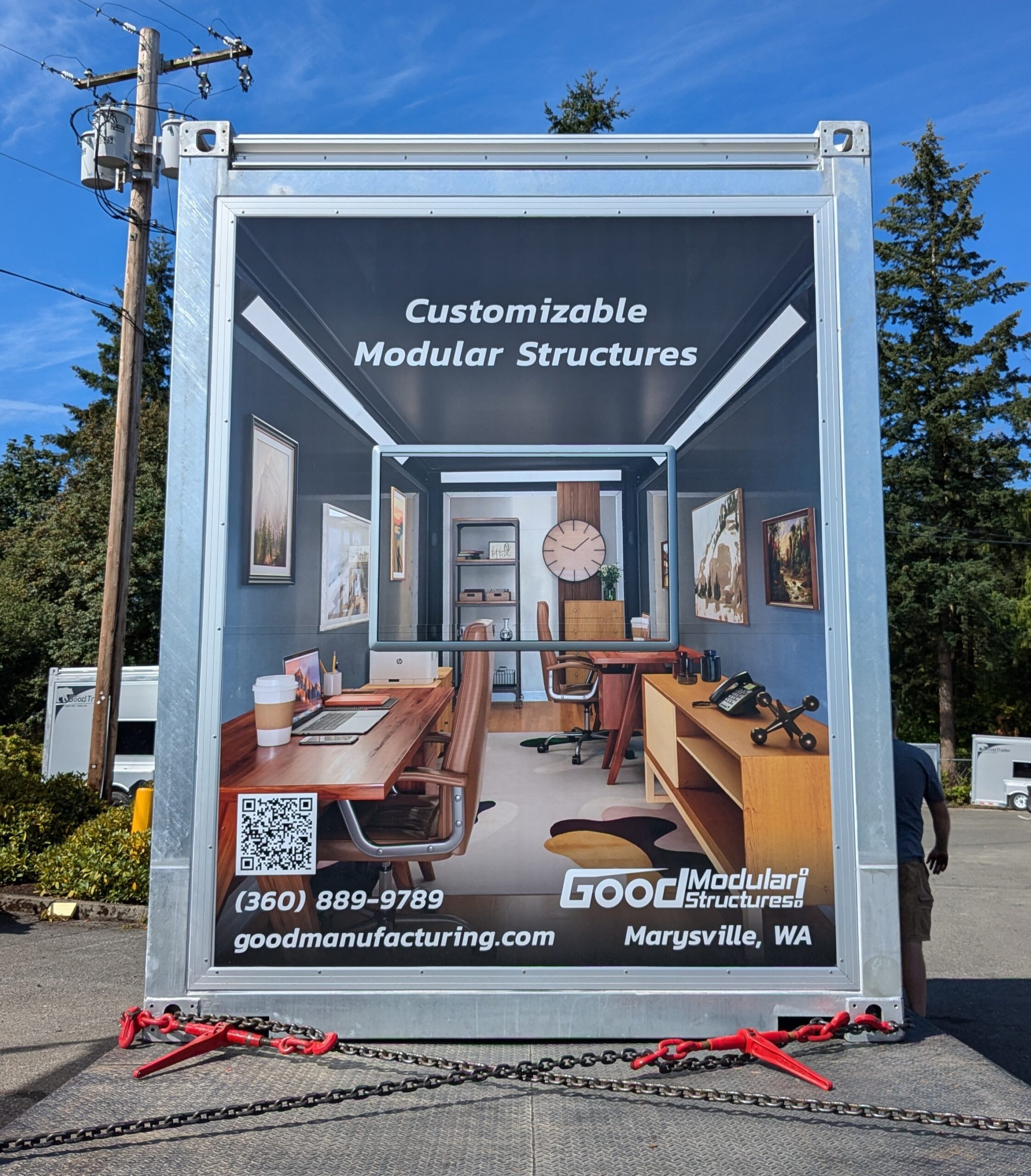
Utilizing a virtual 3D staging tool used for real estate and other applications, I transformed an ordinary photo of the empty interior of this container into a warm and welcoming portable office solution for my client!
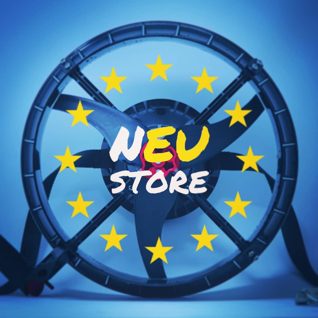
I was pretty proud of this design. My client was opening a new web store exclusively for EU residents, and this was the post I created to advertise it. I combined the ring of stars from the EU’s flag with the circular propeller element of one of my client’s products to concisely convey the message right off the bat. Sprinkle a fun misspelling of “new” to “nEU” and the message is clearer than ever!
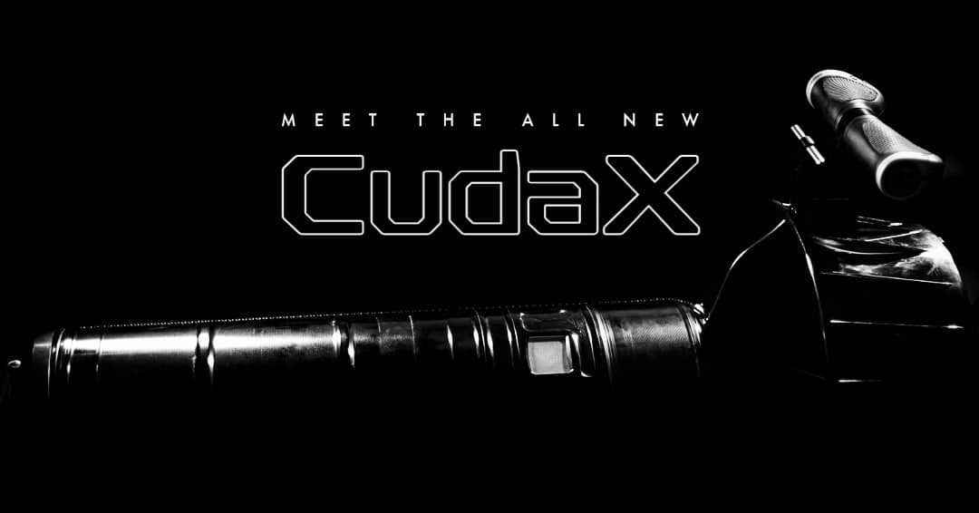
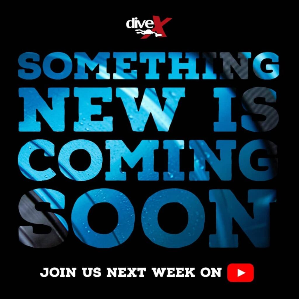
I had a lot of fun photographing this soon-to-be-revealed, professional-grade diving scooter. I leaned into its cleanly-machined lines and tough-looking exterior when I lit it from above/behind and captured this look. I then accentuated the mystery of this highly-anticipated launch with sleek, sophisticated text that added to the aura of high tech. I think this choice perfectly communicated the vibe we were trying to convey to our audience.
This was a fun design to do. It shows off details of a client’s new product, without giving too much away. I remember several followers on social media debated over what it could be. Great trick for engagement and clean presentation in my opinion!